

Concept Project
Dedication to high-quality essentials unlike anything you have ever seen.
Role: UX Researcher, UI & UX Designer, Photographer
Deliverable: Website Prototype
Duration: October - December 2022
Tools: Adobe XD
Problem Definition
How might we optimize the website for e-commerce by highlighting Sensitiva's unique value and selling propositions?
Context
Sensitiva is a Canadian company that is established in 2019 that offers high quality wellness, skincare, bath and pet care essentials. The brand's mission is to help Canadians heal, flourish and live more naturally balanced lives by delivering effective formulas designed to harness the restorative and nourishing power of hemp and all-natural botanical extracts. I had the opportunity to initiate and complete this concept project through a field placement as part of my studies at Centennial College.
The personal care industry appears to be over-saturated, therefore it is crucial for brands to communicate their unique value and selling propositions to their customers clearly and precisely. During the user research phase, I discovered that customers are not aware of who Sensitiva is, how their products stand out from the crowd, and how these products add value to the customers' lives. Conversion is more likely to happen during in-person interactions because there is a dialogue between prospective customer and the associate in-store. If a prospective customer requires any clarification on any of the products, the associate can meet their needs right away.
The goal is for the digital experience to mirror the in-person one. Customers have questions and concerns about which product is right for their skin, which treat is best for their dog, or which topical would be best for their after yoga aches. As an experience architect, I aim to create a concept prototype that sends a clear and reassuring message to the users to encourage conversion.
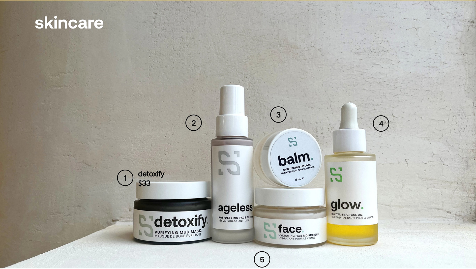
Above: The "shop" page features a styled image of the range of products Sensitiva offers, the product's name and price appear when a user hovers over the numbers.
Proposed Solution
The solution I am proposing is to optimize the information architecture of the existing website. Sensitiva's current website is well-designed and functional, however adding a new page on the high-quality ingredients as well as introducing more interactive elements can further elevate the user experience.
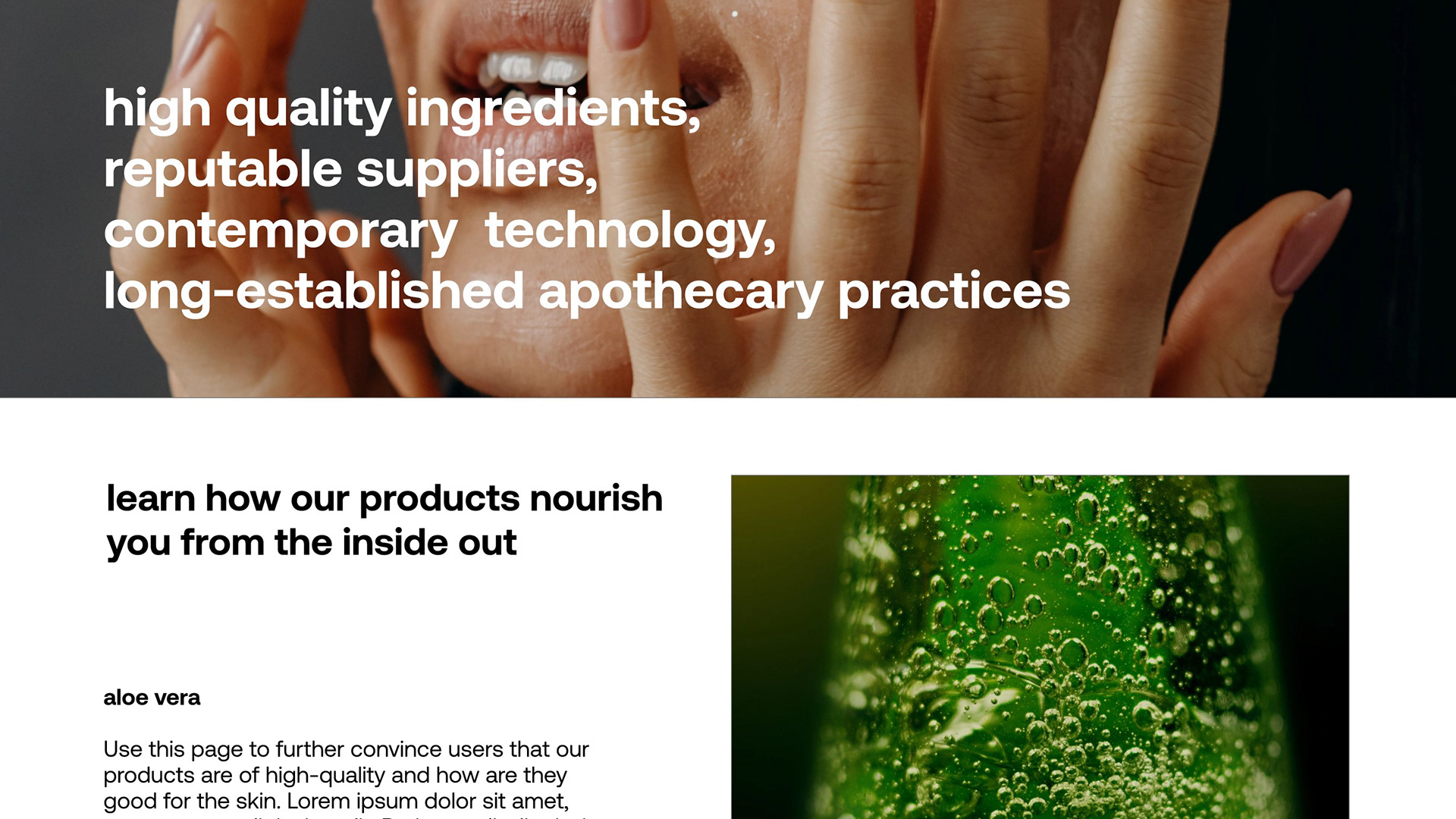
Above: The "learn" page is created to tell an original story that demonstrates Sensitiva's unique selling and value propositions.
The Users
I dedicated a lot of time on user research for this project. To fully understand who the target audience is, I interacted and studied the consumers who visit the physical store. The majority of Sensitiva's customers are health conscious essentialists who are passionate about what goes into the products they use. However, there are some customers who visit the store just because they are intrigued by the interior design. These prospective customers come in with no knowledge of the brand, but with the intention to learn about the products and are open to the idea of possibly incorporating them into their routine.

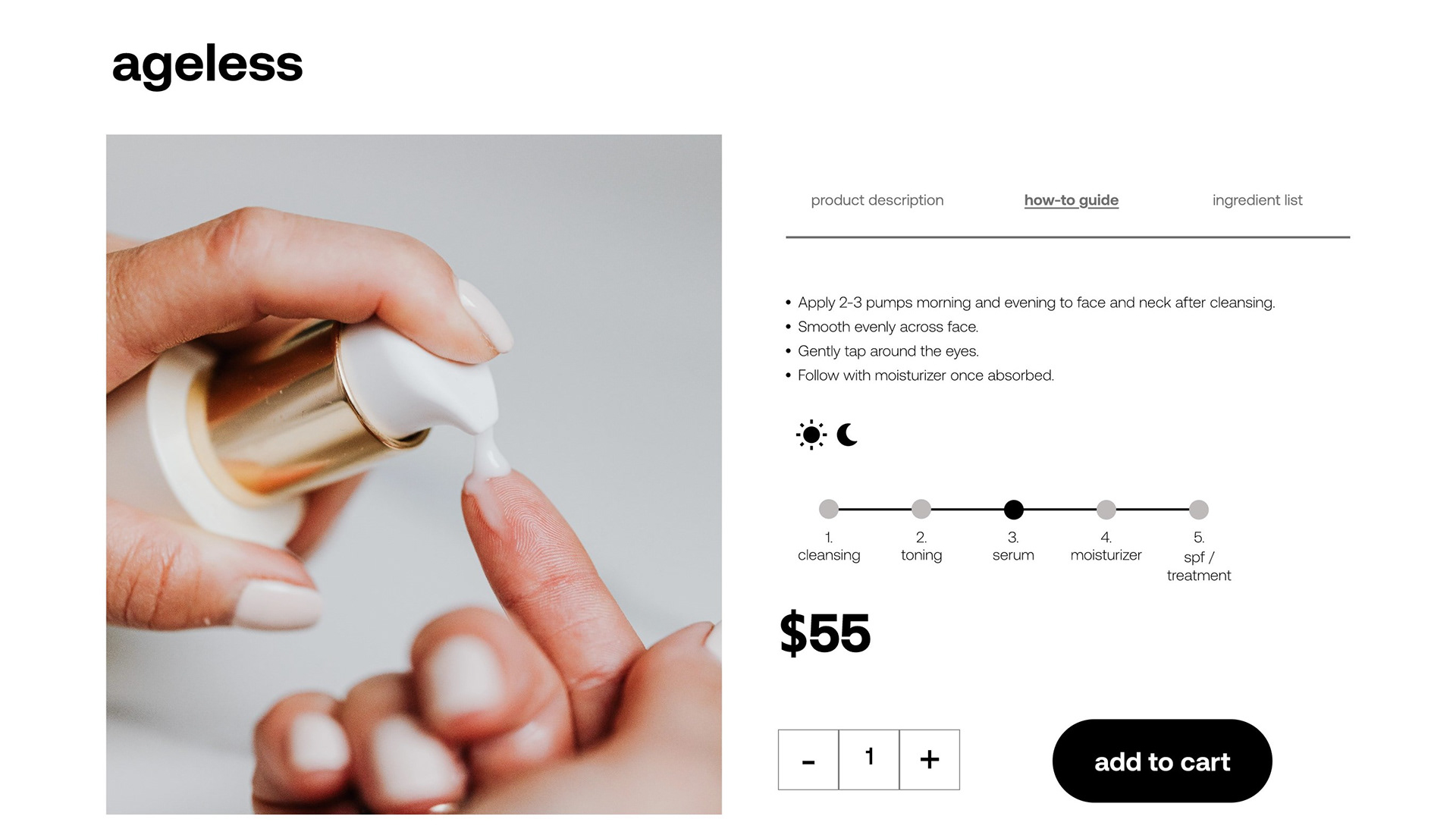
Above: The product page includes a comprehensive description that informs users what the product is good for.
The Process
Research
At this stage, I conducted extensive research on who the users are, what factors influence their decision to purchase something, the competitive landscape in which Sensitiva is positioned as well as the current state of the existing website. I had the opportunity to observe and interact directly with the customers and that have certainly helped me put together an interactive strategy that addresses the users' concerns and meets their requirements.
I curated a short list of essential questions to ask every customer who walks into the physical store that would tell me how they found the brand, what hooked their interest, what are they looking for and if they have shopped with Sensitiva before. I documented my interactions and the answers customers give me. I modelled the user flow on those real life conversations. The questions they ask give me an insight to what needs to be clarified and in the next phase, I utilized design and interactive elements to answer those questions.
Design
When conducting the content audit and current state analysis, I find that the current website is well designed and every element is intentional. There are nothing that feels redundant. However, I think it can be further optimized to tell a more compelling story of the brand. The shopping experience is fairly smooth, however, the directions are located further down, and many users do not scroll down to see it. The directions also do not answer a question that comes up repeatedly: "at which point in my routine do I use it?"
Customers always ask: "what's in it that makes it so special?", "how do I incorporate it into my skincare routine?", "is it suitable for my skin type?" and "how much is it?". In an attempt to answer these questions about the product, I decided to place the product description, how-to guide and ingredient list next to the images. In addition to that, I think an image carousel that shows the unique ingredient, product texture, product application and a styled product image will make the digital experience more realistic.
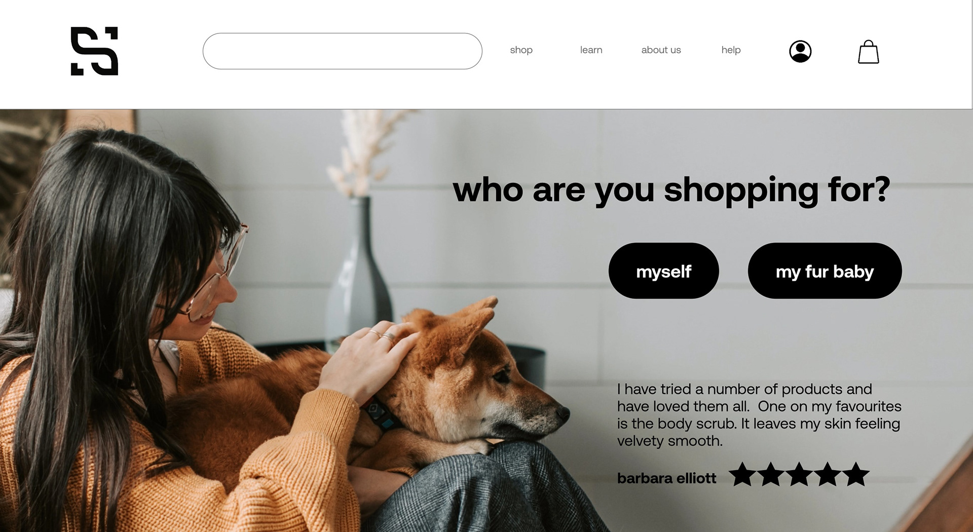
Above: Homepage with a short quiz to help users determine the right products for them.
One of the key moments of the shopping experience is when the store associate asks the customer who they are shopping for. Once the recipient is determined, the associate will then proceed to ask if there are any specific concerns. The goal is to give the customer the most appropriate product recommendation. This crucial opening interaction is included in the homepage of the prototype.
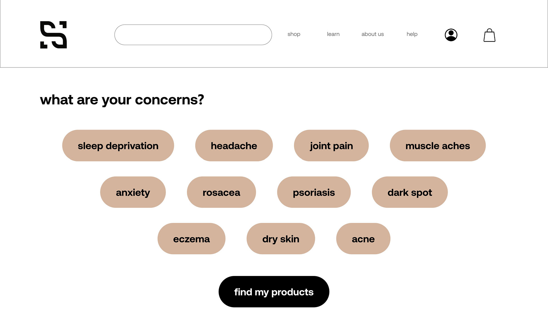
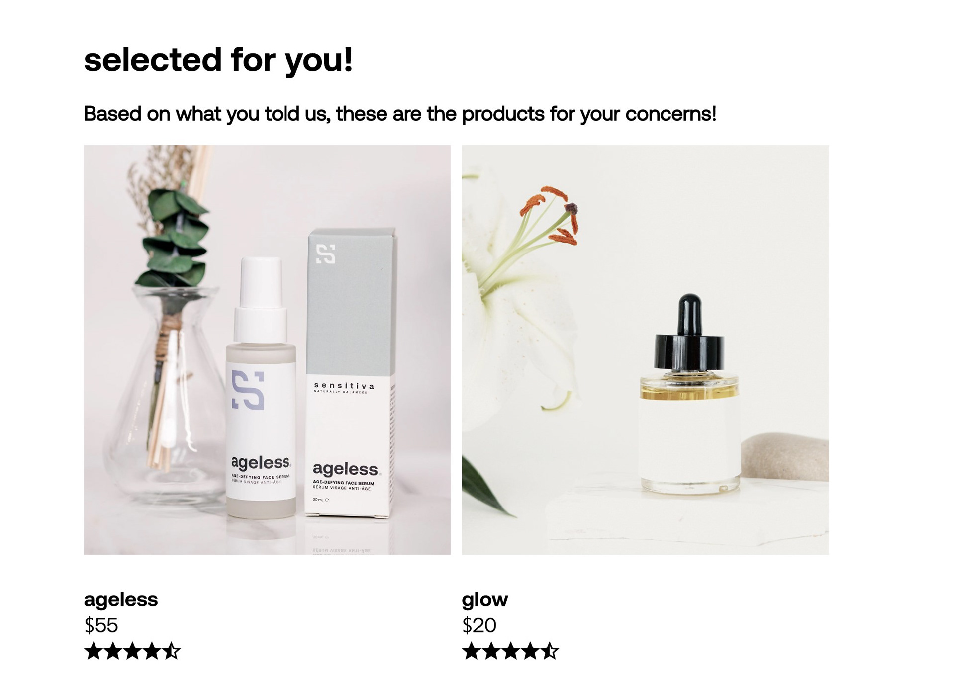
After selecting all the areas of concern that applies to them, the users will be presented with the appropriate products. Another reason behind this design decision is because, while observing the customer's shopping behaviour, I found that many come in with a clear target in mind. They will always ask for a product recommendation for their concerns and once they acquire that product, they will then ask for other products that they can use as a supplement. For example, a customer came into the store, asking for the face moisturizer, and only after she located the item she wants, she will ask for other product recommendations that she can use with the moisturizer.
Testing
I take this stage of every project seriously. User and client feedback are very important to the development of a digital product. To ensure that the prototype is well received by both the end users and the client, I conducted multiple usability tests.
Conclusion
I believe that interactive digital products are never truly finished, and as such, I am still working on it. The demands and requirements of users are continuously changing, and as the experience architect, it is my responsibility to continue to meet their demands. This particular project has been a very valuable learning experience. Not only did I get the opportunity to work with brilliant and passionate individuals, I got to work in a supportive and dynamic environment.

Social Media Marketing: Critical Touchpoint
As a user experience architect, I understand that the user's experience begins way before they enter the website. The first touchpoint for most users happen on Instagram. The new "shop" feature allows the user to interact with a brand's website without leaving Instagram. It would be very beneficial for Sensitiva to fully utilize the new Instagram features to increase brand awareness and make it easier for users to purchase the products. The image above illustrates the ideal user journey if Sensitiva was to add the shop feature to their social media account. From the user research results, it is evident that the brand needs to focus on increasing brand recognition and one of the best ways to do it is to be more strategic with their social media marketing.